Data, Maps & Landscape

A spatial Blog

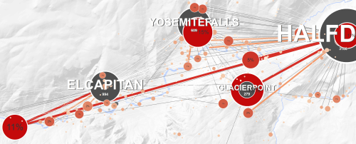
Tag Maps Python Implementation, HDBSCAN and Emoji Clustering

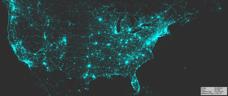
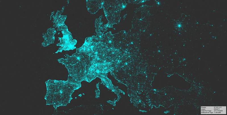
An email today made me aware that I really need to update the YouTube video tutorials on Tag Maps to the new Python implementation. This made so many things easier. The time for processing data for a typical map based on 200,000 photos is now down from 1 hour to 2-5 Minutes (kudos to the stunningly fast single-linkage implementation in HDBSCAN). In fact, ArcGIS is really only needed for final mapping of data – I am still a bit away from replacing the ArcGIS Label Engine.

The great Unicode handling in Python also makes it possible to produce Tag Maps with special characters (København example) and, emojis.

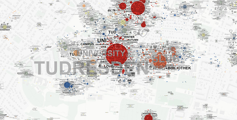
The TU Dresden Campus Tag Map above is based on a combined data set from Flickr and Instagram. It is exciting that this worked so well because each service represents quite different groups of users, which helps portraying a more representative image with these maps. In addition, a 3rd layer was added based on Emoji Clustering. The Emojis on this map were processed equally to the clustering of tags. Emoji clustering is done in a separate step and layers are only merged at the end for visualization. Especially on Instagram, emojis emerge as a new form of communication which is suitable for conveying specific meaning to others. In the resulting emoji-tag-map, both tag and emoji layer seem to complement each other.

There’s a series of upcoming Workshops where I will talk about the new Tag Maps process [February: Kassel, Germany (Regional Planning); March: Virginia Charlottesville, USA (Architecture & Urban Planning) and Leibniz Institut für Länderkunde in Leipzig (Regional Geography Science)]. I hope that I have enough time to update the online Tutorials afterwards. Until then, have a look at the GitHub Tag Maps page which provides at least some information.

Painted by 1,387,131 Artists

The temporal aspect often isn’t visible in static visualizations, but time & space aren’t separable. These visualizations show how Flickr users ‘paint’ a collective map of spatial photo attribution and valuation by contributing thousands of personal experiences each day from 2007 to 2017. The first animation shows global photo locations, with accentuation of areas in Europe, North America and parts of Asia.

Animated Map of globally geotagged Flickr photos, 2007-2017

In Europe (second animation), one can see how linear landscape elements get explored over time such as the Loire continually increasing in brightness as people take pictures along its course. Some users have a larger effect on the visuals than others: those who first visit and upload pictures of a specific geographic area (the ‘early adopters’) cause black pixels switching to color. This is particularly obvious for some linear routes appearing gradually on the map (a photo-documentary of a ferry trip from Amsterdam to London, a hike along the Camino de Santiago, a bike trip along the coast etc.). Lots of interesting patterns to observe here!

Animated Map of geotagged Flickr photos (Europe), 2007-2017

Animated Map of geotagged Flickr photos (North America), 2007-2017

Tag Maps Video Workshops

In the last few months, I put some work into the availability of methods and tools for tag maps generation. I hope the following collection helps to answer some of the questions I received from people who are interested in creating similar maps:

First, there are now two Video Tutorials available that demonstrate how to create Tag Maps from Flickr data:
https://www.youtube.com/watch?v=3K_oVk4vhHE

https://www.youtube.com/watch?v=ejFR3ST1QnU

.. and secondly, all tools are now available as Open Source on GitHub:
1) Clipgeo:
https://github.com/Sieboldianus/ClipGeo
2) Access Photo Database Interface:
https://github.com/Sieboldianus/AccessPhotoDatabaseInterface
3) PHOTO GEOTAG TOOLS Toolbox (ArcGIS):
https://github.com/Sieboldianus/PHOTO-GEOTAG-TOOLS

These pages contain also some basic How to’s and background info.

Workshop Files (without raw data/ without privacy sensitive information)
http://files.alexanderdunkel.com/Workshop_Files_BerlinSpreeinsel.zip

Paradigm shift in Germany: Open Goverment Data

GovData DE

Open Data portal for DE

Last week, the German government finally agreed to the implementation of the Open Data and Open Government action plan before the end of this year (2016).

Some explanation to the unfamiliar reader: Unlike in the USA and in many other countries, data collected by public administration units in Germany is usually not available to the public (despite the fact that administration is financed by public taxes). If any, heavy fees must be paid to access even basic data such as street networks, demographic data, or municipal boundaries. This brought particular disadvantages for German Software and App-Engineering. With this step towards the Open Government, a paradigm shift was completed that originated from the G8 Open Data Charta in 2013.

I remember the day when I needed cadastral data for the city of Bad Schandau in my diploma thesis in 2010. As a student, I had to pay about 1/10th of the regular price (which was about EUR 2500). A signed letter from my Professor was necessary, and I had to wait several weeks for an answer. At least there is hope that this chapter of unnecessary restrictions soon ends.

Different photo patterns based on user origin classification

The base for the following visualizations are two datasets: (1) 147 million worldwide photographs from Flickr, georeferenced between 2007 and 2015, and (2) 415,000 user locations (from 1.3 million total number of users), geocoded through the Bing Maps API.

My original intention was to validate the location information that is provided by users on their public Flickr profile. But some of these graphics are also interesting because they show how individual photo patterns emerge from different cultural origin. In other words, if a person spent his or her time somewhere long enough to specify this place as his or her ‘current location’ on Flickr, it seems possible to conclude that there must be some degree of cultural connection between the person and the place specified.

The first graphic shows the central Mediterranean Sea and photo patterns for 3 groups of photographers from different cultures. It is not surprising that Corsica, being a French island, is dominated by people originating from France. Similarly, Sardinia, an island belonging to Italy, is dominated by Italians. While Majorca belongs to Spain, the island is known as a major tourist destination for Germans. The photo map reflects this phenomenon. At the same time, it seems possible to assign a certain rank order among the shown Mediterranean islands. French photographers seem to have a strong predisposition for visiting Corsica. Italians, albeit showing a strong preference for Sardinia, occasionally also make visits to Corsica. The Germans clearly prefer Majorca, followed by Corsica, and with a least preference for Sardinia.

The second graphic was created for Central Europe. (a) shows all georeferenced photographs from Flickr, whereas (b) shows only the subset of photos taken by Germans. Strikingly visible in the second illustration is (are) the route(s) that German pilgrims seem to take when walking the Camino de Santiago, to the shrine of the apostle St. James in the Cathedral of Santiago de Compostela in Spain. Obviously, Spain is where this path is most dominantly visible because people increasingly merge towards their final destination. In general, these graphics illustrate a strong attribution of meaning, extracted from thousands of photographers’ behaviour. The question is, is this data suitable to measure the public, collective importance of the different routes of the Camino de Santiago, i.e. how representative is it for all pilgrims?

Or, to put it differently: How representative are the Flickr photo patterns to estimate overall visitation rates?

I only found few publications that look into these questions. One is from Wood, S. A., Guerry, A. D., Silver, J. M., & Lacayo, M. (2013). Their results are promising. Throughout my own research, I frequently found that the Flickr data in general is a good proxy for behavioral patterns of the general public. Perhaps this is because Flickr features a fairly diverse group of users. Or, maybe people with similar cultural background tend to perceive the world more equally than originally assumed?

[Edit]
Pretty interesting new paper in this context:
Sessions C., Wood S., Rabotyagov S., Fisher D. (2016). Measuring recreational visitation at U.S. National Parks with crowd-sourced photographs found that overall visitation rates obtained from National Park statistics correlate with Flickr visitation rates & origin.

LVMF Analysis/ Flickr comparison

I recently conducted an analysis of vantage points in London that are protected by the London View Management Framework (LVMF). Shown in red are locations of photos that contain references (title/tags/description) to view/vantage point/skyline/’over london’/’of london’ etc.

For some vantage points, a strong correlation exists between Flickr photos and the LVMF protected viewing location (Primrose Hill summit, for example). But not all vistas are equally well represented. Interestingly, some LVMF protected vantage points are not tagged with view-related references by the Flickr community (Westminster Pier, for example). The results will be part of a more detailed discussion in my final PhD thesis chapter.

Paper published in Landscape and Urban Planning

Magazine Cover

Landscape and Urban Planning

I received the invitation for contributing a research paper to Landscape and Urban Planning back in October 2012. I am very happy that this paper now appeared in Vol. 142’s Special Issue: Critical Approaches to Landscape Visualization. Considering the diversity of contributions and topics in this special issue, the guest editorial team, specifically Katherine Foo and Emily Gallagher, did a great job coordinating all submissions.

The paper was selected as Editors’ Choice and received the 2015 Weddle Prize, it is also freely available on the Journal’s website. It is basically a short version of my PhD thesis and contains a summary of the preliminary results. I am expecting to publish the final thesis early next year.

A personal copy of the accepted manuscript is available on my website.

Toolkit available

I finally found the time to publish the tools I used for processing and visualizing Flickr photo data (e.g. visualizations on maps.alexanderdunkel.com). Primarily, this step is intended to supply updated software versions to Workshop participants (University of Waterloo, University of Toronto, University of Technology Dresden). All parts of the toolkit are Creative Commons CC BY-NC-SA 4.0 (this is a non-commercial license, in accordance with Flickr’s terms of use). Please note: for the time being, I can not provide any support. Also, please note that the Data itself is not included here (because it would be a against Flickr’s terms of use).

I developed this toolset as a software that assists in filtering, mapping, and visualizing photo location data from Flickr for application to the fields of landscape and urban planning. It consists of 3 tools:

2017-04-18 Important – All tools are now available as Open Source on Github: 1) Clipgeo 2) Access Photo Database Interface 3) PHOTO GEOTAG TOOLS Toolbox

GetGeo v0.9.2

(Windows 7/8)

Software for retrieving and filtering photo location data with basic visualization functionality. The output can be a map that is directly generated from data, or a number of text files that can be imported to GIS Software for advanced processing and analysis. A readme file is provided in the .zip file, please read first.

Main features:
– retrieving photo data for a specific area from Flickr API
(currently, this function is set to private)
– managing a local photo location database
– filtering photos based on photo timestamps, area/shapefiles or specific search strings for titles and/or tags

Link: GetGeo_0.9.2.zip

Photo Database Interface v4.0

(MS Access 2007/2013)

This interface for Microsoft Access helps in filtering data and seeking for advanced patterns in data (tag occurrences, user occurrences, time-stamp distribution). Works with free Microsoft Access 2013 Runtime (64bit).

Main features:
– importing clipped data files from GetGeo
– cleaning up tag data
– exporting an ArcGIS compatible database (*.mdb)
– time analysis (month, daytime, year)
– preparing taglist (*.dbf) for clustering tag data

Link: importdata_templ.accdb

ArcGIS Photo Processing Toolbox v2.0

(ESRI ArcGIS 10.1/2)

This toolbox contains a number of tools developed for aggregating photo location data in ESRI ArcGIS. The newest version is compatible with ArcGIS 10.2. This version also contains a bugfix that solves an issue with the iteration stopping after first item during tag clustering.

Main features:
– clustering tag data based on list
– aggregating multiple photo locations to a smaller number
– weighting tag data

Link: PhotoGeotagTools.tbx

Workshop Files

For a step-by-step guidance on how to use these tools to create final visualizations, have a look at the following pdf’s (42 pages). These were created for the UW and UT Workshops:

The following zip-File contains layout .mxd and sample data that is used in the Workshop to create a map for Highpark in Toronto.

Visualizations of globally georeferenced Flickr photos

Over two years and no update or blog entry! I thought this would be a good start to add some content to this site.

The maps below are visualizations of geotagged photos uploaded to Flickr between 2007 to 2015 and geotagged with the highest location accuracy (streetlevel accuracy).
I generated a number of different visualizations. Some are more artistic in style while others are designed more informative.

These were created as part of my research project (maps.alexanderdunkel.com). The maps are (obviously) biased towards the western world (Europe, North America). Moreover, it seems likely that even the few photos located in Africa (and other underdeveloped parts of the world) are equally provided by this specific group. My original intention was to demonstrate that the Flickr data, albeit not universally representative, provides a particular view of the world (a ‘lens’ that is western culture-centric). But I think these maps are also just very interesting to look at.

A final note: this type of visualization has already been done years before (check out Eric Fischer’s maps). Maybe the statistics going on on the lower-right corner provide some additional information not available so far.

Hello Real World.

I finally did it – setting up my blog. This will be a place to collect thoughts around my thesis I am currently working on: Network Landscapes and everything related to it. This means writing about new developments I find interesting; programming and code-snippets; GIS and data analysis; the mind, cognition & perception of landscapes and the world, the environment, and the cities around us.
Primarily, this will help me getting thoughts & ideas ordered. But this blog is also aimed at Landscape Architects, Architects and Landscape & Urban Planners who seek to explore the increasing digital part of our environment and its links to the physical world. This interdisciplinary field of research is just emerging, but there is an increasing demand for communication and discussion on theories, concepts and frameworks.
For now, I will leave it as it is and let the blog define itself by its future entries.