Different photo patterns based on user origin classification
by alexdunkel
The base for the following visualizations are two datasets: (1) 147 million worldwide photographs from Flickr, georeferenced between 2007 and 2015, and (2) 415,000 user locations (from 1.3 million total number of users), geocoded through the Bing Maps API.
My original intention was to validate the location information that is provided by users on their public Flickr profile. But some of these graphics are also interesting because they show how individual photo patterns emerge from different cultural origin. In other words, if a person spent his or her time somewhere long enough to specify this place as his or her ‘current location’ on Flickr, it seems possible to conclude that there must be some degree of cultural connection between the person and the place specified.
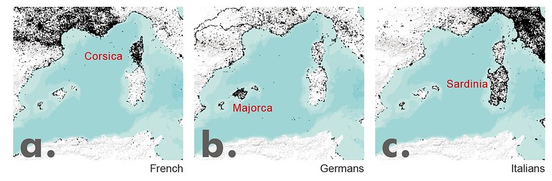
The first graphic shows the central Mediterranean Sea and photo patterns for 3 groups of photographers from different cultures. It is not surprising that Corsica, being a French island, is dominated by people originating from France. Similarly, Sardinia, an island belonging to Italy, is dominated by Italians. While Majorca belongs to Spain, the island is known as a major tourist destination for Germans. The photo map reflects this phenomenon. At the same time, it seems possible to assign a certain rank order among the shown Mediterranean islands. French photographers seem to have a strong predisposition for visiting Corsica. Italians, albeit showing a strong preference for Sardinia, occasionally also make visits to Corsica. The Germans clearly prefer Majorca, followed by Corsica, and with a least preference for Sardinia.
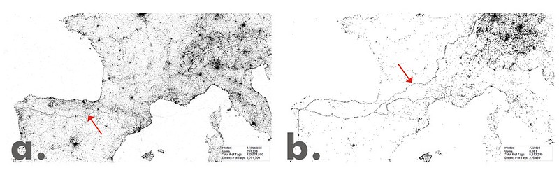
The second graphic was created for Central Europe. (a) shows all georeferenced photographs from Flickr, whereas (b) shows only the subset of photos taken by Germans. Strikingly visible in the second illustration is (are) the route(s) that German pilgrims seem to take when walking the Camino de Santiago, to the shrine of the apostle St. James in the Cathedral of Santiago de Compostela in Spain. Obviously, Spain is where this path is most dominantly visible because people increasingly merge towards their final destination. In general, these graphics illustrate a strong attribution of meaning, extracted from thousands of photographers’ behaviour. The question is, is this data suitable to measure the public, collective importance of the different routes of the Camino de Santiago, i.e. how representative is it for all pilgrims?
Or, to put it differently: How representative are the Flickr photo patterns to estimate overall visitation rates?
I only found few publications that look into these questions. One is from Wood, S. A., Guerry, A. D., Silver, J. M., & Lacayo, M. (2013). Their results are promising. Throughout my own research, I frequently found that the Flickr data in general is a good proxy for behavioral patterns of the general public. Perhaps this is because Flickr features a fairly diverse group of users. Or, maybe people with similar cultural background tend to perceive the world more equally than originally assumed?
[Edit]
Pretty interesting new paper in this context:
Sessions C., Wood S., Rabotyagov S., Fisher D. (2016). Measuring recreational visitation at U.S. National Parks with crowd-sourced photographs found that overall visitation rates obtained from National Park statistics correlate with Flickr visitation rates & origin.